

Doctors Network
Overview
Doctors Network is a health-tech start-up that seeks to bridge the gap between doctors and patients by connecting them directly. This is a subscription service where doctors create their paid subscription plans to offer their patients at a low fee.
Skills
Desk Research, Wireframing, AB Testing, Flow Charts, Prototyping, Visual Design
Tools
Sketch, Photoshop, Illustrator, Google Analytics, VMO
Overview
Team Size: 4
Role: UI/UX, Visual Design
Website: doctorsnetwork.com
Problem Area
The existing design had an almost 90% bounce rate. It would appear that the site was not being seen as a serious service. The company needed a way to better pique the interest of its visitors for them to engage with the site, much less sign-up.
Re-design
I was initially contracted to re-design the existing doctors’ network marketing website. Along with designing an app that serves both subscribers or provider once they have logged into the system. This also required an admin section to manage all users.
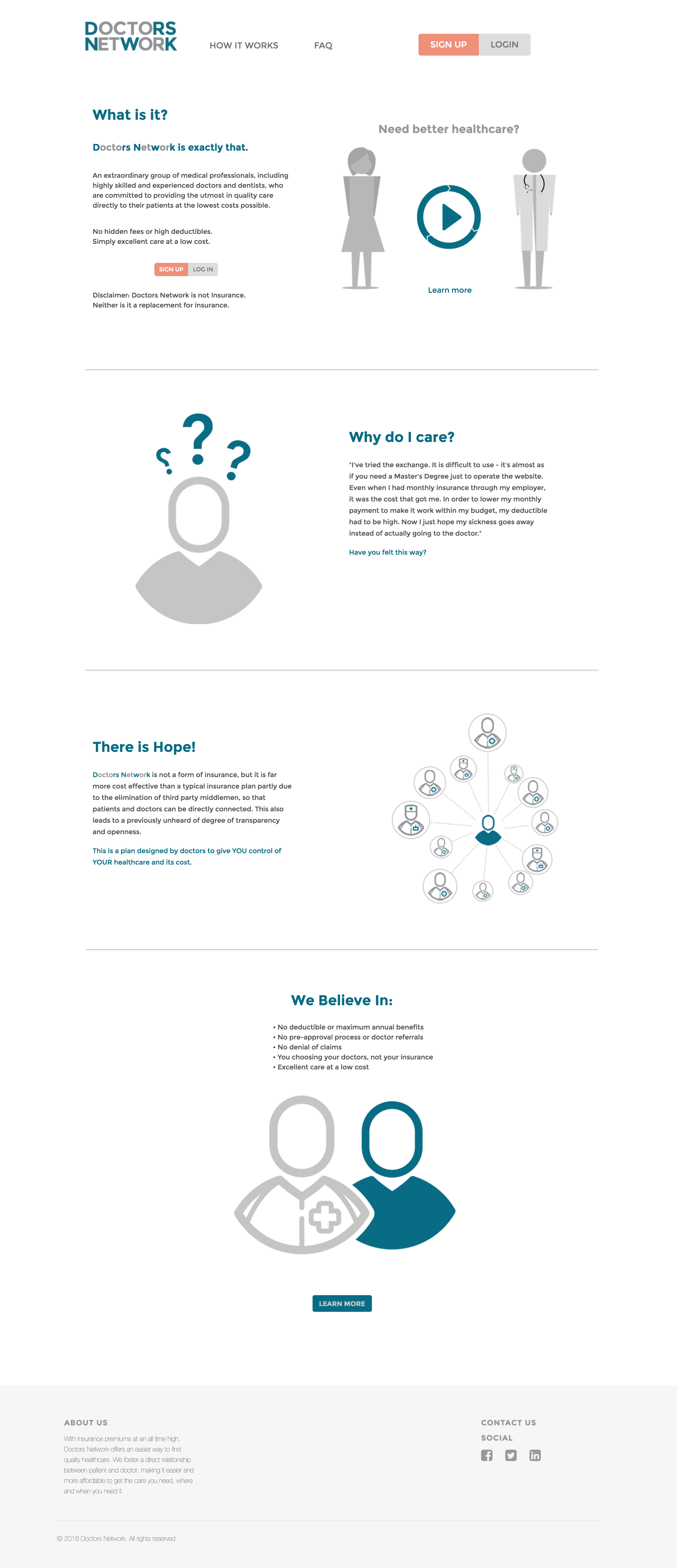


As the business goals became clearer, I introduced a doctors page since patients were not the only focus.

The checkout page explains to the patient that immediately they will only be charged the enrollment fee and on the 20th they will then be charged the subscription fee.


The App services both patients and doctors. The sub-menu items are located on the collapsible menu on the left-hand side.
Process
target users + Revenue model
I discussed the purpose of the site with stakeholders to better understand the goals of the business was aiming to reach. I also worked with them to narrow down the target users. This helped to identify a specific demographic that these services might appeal to. Later we worked towards establishing a revenue model based on the company’s overhead cost.
desk research
To understand the issue, I performed a desk research to see where the service would fall into play. I investigated competitors in the space to learn:
- Services they offered
- Enrollment policies
- Out of pocket expenses
- Fee per procedure
Recruiting Providers
This service was quickly brought to the market with the aim of bringing awareness to providers in the field that they could be signed on before it was being marketed to potential patients. This posed more of an issue that initially anticipated. Providers were skeptical about:
- Revenue Model
- Retention of Patients
- Longevity of the service
- Earning Possibilities
Wireframes
After creating the rough sketches, I digitized them to get a better relation to size and content.

Sign-Up Flow with Wireframes
Based on my research and analytics of user behavior I learned more about of how users were accessing the site. Therefore, I found it necessary to focus on the mobile interactions early on.

Visual Design + A/B Testing
With the new changes to this site, it had a significant boost in time spent on the time. The bounce rate decreased by around 40% with the first release. After seeing the various users behavior on the site, we started A/B testing the content and information layout. We used these learnings to further customize the site and make decisions such as CTA layout and terminologies used.
Visual artifacts
While working on this project I created many digital assets used for the company’s website, emails and marketing material.
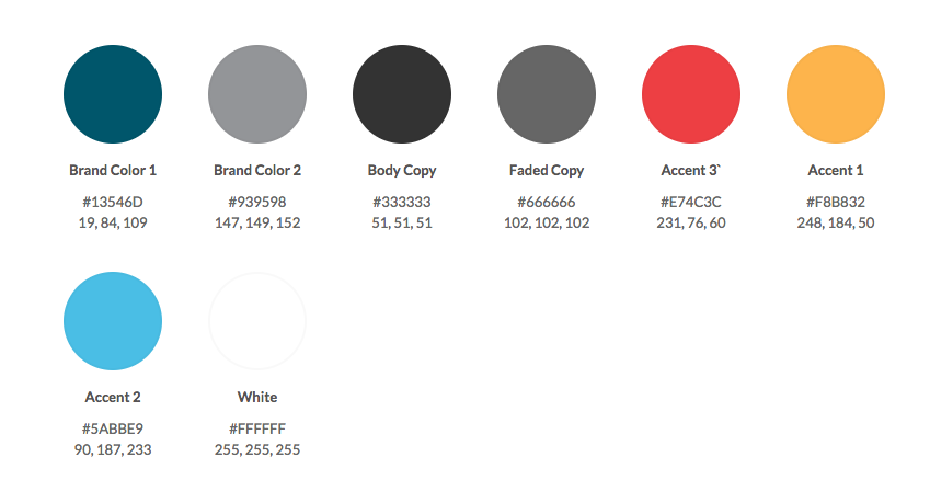
color palette
typography


closing
I learned many things from this project but I’d say one of my biggest takeaways is to keep experimenting, try new things even if it feels uncomfortable. And keep showing your work, you’d be surprised how many different perspectives you can gather to help shape your ideas.